Are you fundraising with limited resources? Then Canva is probably already in your toolkit. If not, let's set you up to make free posters, banners, and social media templates to market your raffle and raise more with your raffle.
But do you really need to make graphics to grow your raffle?
You do if you want to raise more.
We say “online raffles run in the background” because people can buy tickets 24/7 when you’re online.
That said, people can't buy tickets if they don't know about your raffle.
That's why we insist on getting comfortable with Canva. You need a poster that pops. Scroll-stopping social media pictures. Raffle banners that go boom.
The bare minimum is having a visual that promotes your raffle.
But having engaging and professional marketing material is how you’ll build a raffle that 🎉 pops off 🎉 (as the kids say.)
So, get Canva. It’s free.
Step 1: Get your free Canva Pro account for not-for-profits
If you're a registered charity or not-for-profit and you don’t have free Canva Pro account yet, click here to fill out the application now. (All you need is a copy of a financial or governing document that shows you’re a registered charity.)
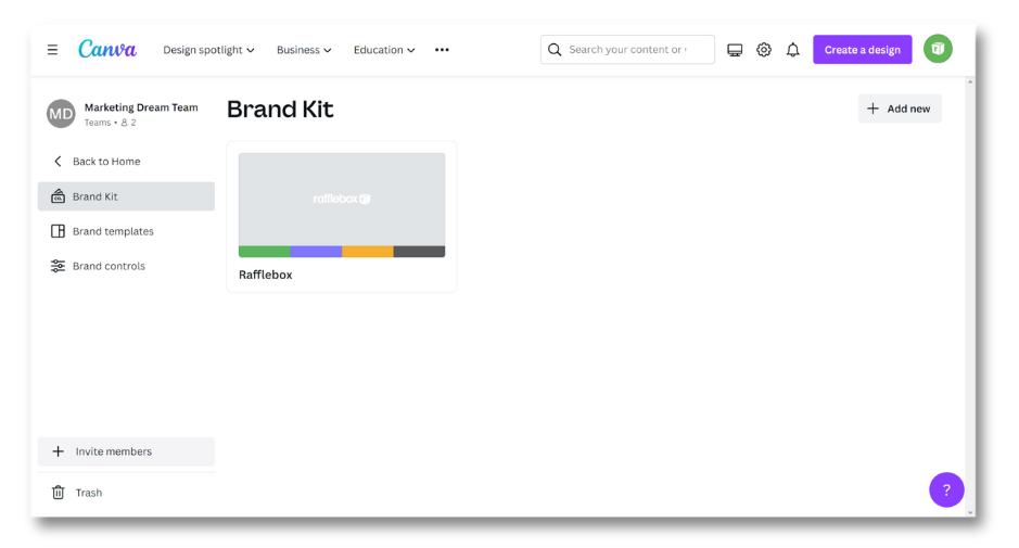
Step 2: Upload your brand assets, images, and more to your Canva account

Every group has a "brand", even if it's just one person running the show.
Now is a good time to upload anything brand-related, like:
✅ A transparent version of your logo (if you don’t have one, Canva Pro has a free background remover).
✅ Your brand colors and fonts (if applicable.)
✅ Any past event or fundraiser photos.
Step 3: Choose your go-to templates
Here are a few essential templates you can edit for your group and cause.
• Raffle banner
• Poster
• Social media post
• Social media Story
Step 4: Edit your template using basic design principles
We want to say it's time to get creative, but honestly, just follow Canva’s lead.
Keep these tips in mind when editing your raffle banner and other templates:
• Stay within the pink lines.
Canva gives you barriers so your image doesn’t stretch or get cut off.
You can stretch your background color beyond these lines, but don’t put any pictures or text outside of them.
• Put your key messages front and center
Within seconds, you need to get across:
1. That you're running a raffle, and
2. Who you are or what you're raising funds for.
Put these on your banner. Details like the draw date, ticket prices, and how to get tickets can go in the caption (which should also be as short and sweet as possible.)
• Pick colours that make sense
Super bright, contrasting colors can be overwhelming.
But neutral fades into the background.
If you have brand colors, they likely follow color theory — the concept that certain colors complement each other and others clash, and aren't "pleasing to the eye".
If you're stuck on what colours to use on your templates, here are a few thought starters:
• Orange symbolizes energy, so use it if you're raising funds for a sports foundation, sports team, recreation organization, or other "active" cause 💥
• Purple symbolizes courage, so use it if you're running a raffle that supports people or animals who demonstrate it. 💜
• Green can symbolize the environment🌳 and/or money 💲
• If you're a sports team, use your jersey or uniform colors to help people recognize you 🧢
Then if you're really on a roll, use Canva’s colour wheel tool to see confirm if your colours work together.
Step 5: Review your graphics and see if they follow the “rules”
Let’s do a quick review to see if we’re following best practices:
✅ Text and images are within the pink lines
✅ Less than 20% of your graphic is made up of text
✅ There are two images, max, on your graphic
✅ It’s clear that you’re running a 50/50 or prize raffle
✅ Your colors pass this test
Step 6: Download the right format files and you're good to do
• Images: .png or .jpeg.
• Videos: .mp4.
• Posters and other print materials: .pdf.
Tag us on social when you post your creations! And if you're not running a raffle yet, let's set you up to fundraise more. Reach out and we'll send a Rafflebox overview:


